Article
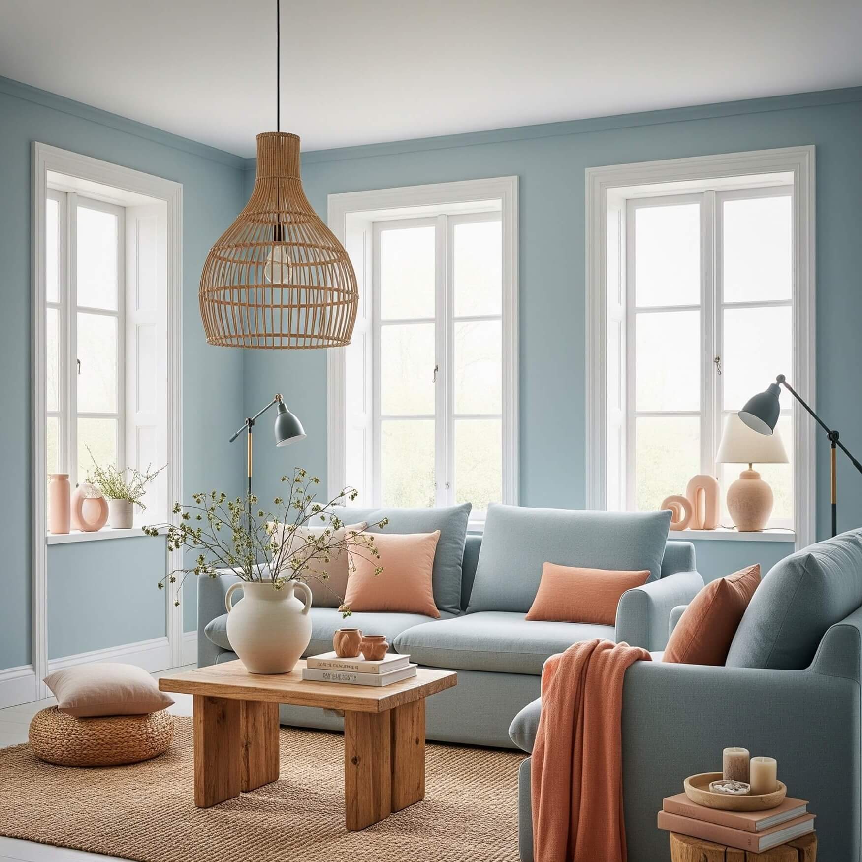
Mastering Your Home’s Palette: A Comprehensive Guide to Interior Decorating with Color

Related Posts
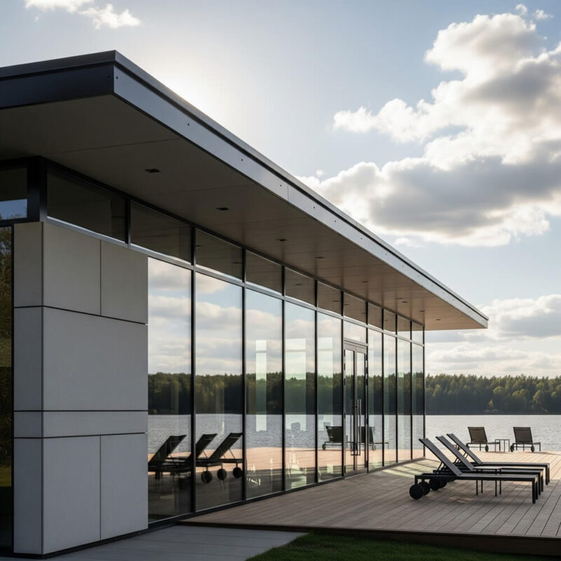
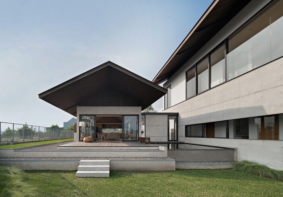
The Evolution of Modern Architecture: From Form to Function, A Deeper Dive
-
Posted by
masoud
Modern architecture is a story of radical innovation that fundamentally changed how we design and inhabit our built environment. It eme...
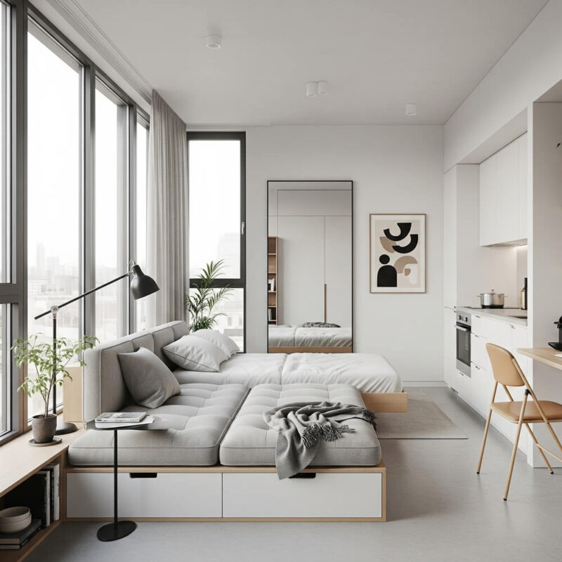
Transforming Small Spaces: Smart Solutions for Compact Living
-
Posted by
Living in a small space doesn't mean you have to sacrifice style or comfort. With a little creativity and some smart design solutions, ...
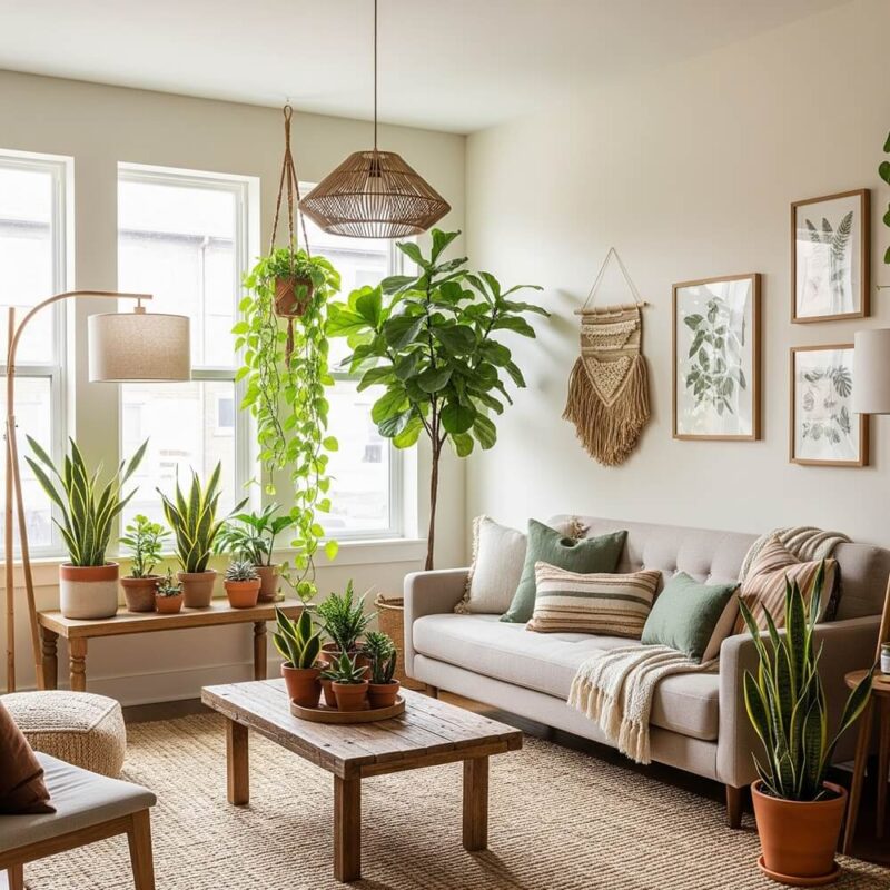
Sustainable Interior Design: Your Ultimate Guide to a Beautiful, Eco-Friendly Home
-
Posted by
In today's world, the concept of "home" is evolving. It's no longer just about aesthetics and comfort; it's about creating a space that...
Modern Buildings: The Resurgence of Craftsmanship and Local Materials
-
Posted by
Modern Buildings: The Resurgence of Craftsmanship and Local Materials
Modern Buildings: The Resurgence of Craftsmanship and Loca...